Jurassic Park, Unix and My UI Makeover
2021-06-12
I really like the book Jurassic Park, but I kind of have an obsession with the movie. Perhaps it's the only movie I like element-wise than as a whole. I like the music, the photography, the special effects and the CGI individually. But the real obsession is with the behind-the-scenes stuff. I'have tried to track down and read or watch every article, interview and documentary on its making. And they really overlap with my another area of interest--computers.
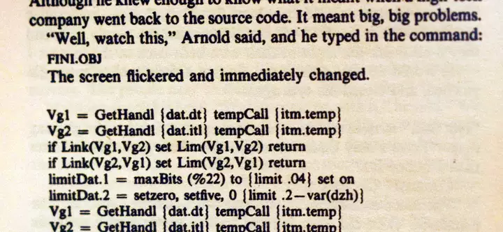
Crichton's novel is full of computer-realted stuff--graphs, source code listings, geeky talk, etc. Although the movie differs largely by altering and shortening it all, it still is rich in spirit and has more computers behind the scenes.

The computers that took part in the creation of Jurassic Park are Silicon Graphics machines. They also got featured in the movie itself (alongside Apple machines). Every time I see them on screen--either in the movie or in a making-of document--I get connected. I've never used (or even seen in person) a Silicon Graphics machine, but I get connected. The operating system being Unix-like has something to do with it. I don't think that I like Unix in movies because I grew up reading about it and trying GNU/Linux, or I like Unix-like systems in real life because of these movies. Certainly they enforced each other, but the real reason must be that passionate (not just professional) programmers have a thing for Unix-like systems (compared to Windows, which is developed by businessmen for doing boring business stuff).
I'm a Free Software person, but that won't stop me from appreciating the beauty and power of other systems. In the recent one or two years, most of my online searches related to Jurassic Park were centered around Silicon Graphics machines. Finally, combined with my hate for moderns UI designs that confuse a button for a label and my never-ending love for Motif-like chiseled widgets (except for the absence of anti-aliasing), I wanted my GUI and windows to resemble Silicon Graphics IRIX.
This wasn't the first time I had tried something like this. May be a year ago, after compiling and trying CDE on GNU/Linux, I wanted the same Motif look on Xfce, and tried some CDE-looking themes for GTK. I don't remember if I was actually after CDE or IRIX. Probably I was trying to do the same thing I wanted now, but got to CDE after realizing maybe that's the only thing I can get on GNU/Linux that's close to IRIX in looks. Anyway, the themes I tried from the Internet weren't compelling enough to make me switch from the modern dark themes that I've been using for years.
However, the same themes became my starting point this time. cdetheme-solaris, one among those CDE-based themes, felt IRIX enough except for the window borders. So I decided to modify it, but soon realized it's a lot of work.
I usually enjoy taking effort in programming but not in something like theme development, not because it is trivial, but because I'm less skillful at it and my time is better spent on programming.
So I decided to search again for existing themes. Then I got this Xfwm (the window manager of Xfce) theme that mimics the window decoration found on Silicon Graphics IRIX systems. Combining this with cdetheme-solaris for GTK (i.e. the widgets like buttons and scrollbars), I got the retro look I was looking for. The only problem is with apps that use GtkHeaderBar instead of the classic window boarders (Gedit, for instance). They work perfect, but simply miss the decoration from the window manager theme as always.
Turns out the window manager theme has been in existence since 2006. The README file says it was created by John Tsiombikas and is derived from actual screenshots taken from a machine running IRIX and 4Dwm (the window manager used in IRIX).
I got cdetheme-solaris from xfce-look.org. Couldn't find who developed it, but looks like a real effort. It even seems to include scripts to display the classic CDE panel, which part I deleted after unpacking the theme because keeping scripts of unknown origin is a security risk. After all, all I wanted was just a new skin for GTK3 widgets, and the CSS files and images were sufficient for that.
Anyway, I'm really thankful to those who developed these themes.
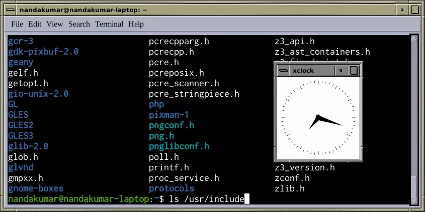
Now, what happened next is really important. While browsing more oldschool desktop screenshots, I noticed that some were using serif fonts. I liked serif on paper, but the last time I tried it for UI, it looked rusty on screen. This is what the screenshots told too. But wait, I've been using serif on this site for a long! I've been reading serif on the screen for a while! sure the UI font size is much smaller, but the displays have got better. So I tried that too. Perfect! So now I have Xfce with cdetheme-solaris for widgets, sgi theme for the window manager, and serif text on the UI. Can't get more retro with GUI.

The only thing that could've been a concern is that this isn't dark mode. But thankfully, although not white on black, the grey window background of cdetheme-solaris looks dark enough, even better than an inverted theme.
PS: There is a project named MaXX Interactive Desktop which seems to be recreating the SGI IRIX desktop on GNU/Linux. I don't know much about it, even what license it comes with.
Nandakumar Edamana
Tags: retro, jurassic-park, unix, ui, computer, reading, books, movies
Read more from Nandakumar at nandakumar.org/blog/
