Bootstrapping a New Logo for Vara
2024-06-08
Recently I spent at least four hours programming a new logo for Vara, a minimalist digital painting application I developed. If the phrase "programming a logo" sounds strange to you, have a look at music production. MIDI files are music, but they contain instructions for instruments rather than recorded audio. "Programming" a synthesizer keyboard is a thing. The self-playing vintage pianos that we see in ghost films were real and common decades ago, and they were "programmed" in punch sheets.
Using instructions instead of rendered output is common in computer graphics when you want something to be scalable, and of course when you are creating it for the first time. When you design a logo using a program like Inkscape, generating these instructions in the form of an SVG file is taken care of by Inkscape, but you can do this manually as well, theorectically speaking. If this info is already boring to you, maybe have a look at the PostScript language, which is more programmatic than SVG.
So, am I talking about manually writing an SVG file? Or coding up the same in Python or something? Neither. It’s about using reusing the routines in a drawing program to produce its own logo. I don’t have any examples, but I’m sure I’m not the first person to do it. Still, it was an interesting experience.
Let me first show you the new Vara logo:
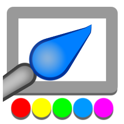
If you think it’s lame, have look at the original logo:
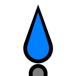
The old logo was arguably suitable for a drawing program that focuses on simplicity, but I believe the new one is an improvement.
I had no plans of updating the logo, until I made Vara available on Flathub. My logo was breaking every single rule listed in their quality guidelines. While I disagree with the guideline "the icon should be somewhat in line with the contemporary icon styles" (this is okay for stock apps shipped with an OS, but why force others to drop their identity and unique tastes?), all other points are mostly technical and valid. For example, the icon should have a reasonable footprint, should be compatible with both light and dark backgrounds, etc.
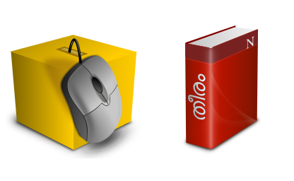
Not all of my logos are lame-looking. Have a look below at some of the icons I designed at least ten years ago using Inkscape. (Yes, the 3D-looking mouse is drawn in Inkscape by manually tracing a photo.) They may not be perfect, but at least not lame-looking.
Then why did I come up with such a lame logo for Vara? Maybe because I was tired or was in a hurry? Afterall, Vara was created in under a month. True, but the real reason I wanted to keep the logo as is was it was drawn procedurally within Vara itself. Let me explain. Vara is a drawing program, and naturally it had routines to select tools, configure them, and draw with them. Calling them in the right sequence with right parameters would present you with a picture in the canvas, without you ever touching the mouse. Much like macros, but availale only to those who are ready to fiddle with the source code. This is how the original logo was created. I really like the idea of bootstrapping (essentially using something to create itself), so I didn’t want to use Inkscape this time.
But the logo was breaking technical guidelines, which needed to be fixed. Soon it felt like the looks needed some fixing as well. The facts that Vara is focused on minimalism and contemporary icons are minimalistic weren’t helping with the minimal design of the original Vara logo, because it looked too minimal, much like something a solo Visual Basic programmer would draw hastily in MS Paint or Photoshop. Maybe suitable Windows 8.
It was clear that I could fix the dimensions of the original Vara logo programmatically with Vara itself, but could I improve the looks as well? Vara had limitations baked in, but I took up the challenge anyway. First I created some crude concepts using Inkscape and Vara itself:
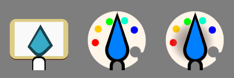
Since those drawings are extremely crude, let me explain what they mean. The first one shows a brush against a canvas placed on a cardboard drawing pad. The second image shows a brush with a palette in the background, the third one adding a gradient.
Although you can draw very creatively and freely in Vara, programmatic drawing isn’t easy because Vara doesn’t have Bezier curves (which is not needed for digital painting). So all the elements in these images were carefully picked. For example, the circular palette could be drawn by dipping a large round brush and erasing a small portion of it.
I didn’t like the palette idea because that was a cliche for painting app logos. So I started with the canvas idea. The brown area of the cardboard drawing pad soon became the bezel of a digital display. This was for both technical (border color contrast) and semantic reasons. Then came the idea to place the palette inside the display, like in the app. But since the display was horizontal and there was space available below the display, the palette soon became outside the display. I’d always wanted the palette to be in the logo because the rainbow-like palette is the thing that makes the screenshot of Vara interesting to me, and now it was possible to do so without the round palette cliche.
Here’s the evolution of the logo:
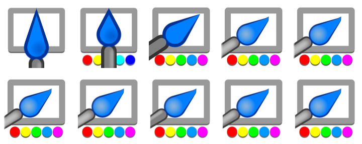
The colors in the palette resemble a typical HSV palette spectrum, but it is made less technical. The key points in such a spectrum are Red, Yellow, Green, Cyan, Blue, Magenta, and Red again. I dropped the last Red to avoid repetition, merged and toned down Blue and Cyan to make it look less amateurish.
Coming to the drawing techniques, the solid circles are single dips of the round brush, color gradients are dips or strokes of the smooth brush, and the cone shapes are created using the pressure-sensitive brush with different source and destination pressures.
Lean lines with the smooth brush can give the classic 3D look, but modern icons have a flat 3D look, which can be obtained by using a large smooth brush. This difference is visible in the last couple of iterations (look at the highlight in the brush handle).
Pure black is not used, and the border colors are selected in a way that is suitable for both light and dark modes (to the extend possible).
I'm sure professional designers will be able to point out technical and aesthetic issues in the new logo as well, but this output feels satisfactory for a procedural drawing plus bootstrapping experiment.
Trivia
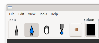
While trying to modify the code for the logo, I couldn’t locate it first. Turns out a year ago I was just reusing the icon for the brush tool! Yes, I had created procedural icons for all the tools except fot the fill tool, which I couldn’t come up with any. I didn’t use them for the toolbar, but the brush icon became the Vara logo.
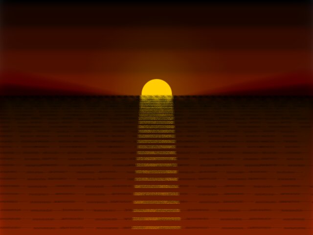
These drawing macros were part of a test suit, and here is the output of one automated test:
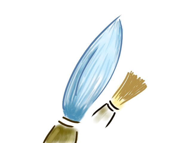
So here ends this unstructured saga of a silly weekend adventure. But before concluding, let me make one thing clear: mechanical drawing with Vara was just added fun; it's originally meant for manual fun. Have a look at what I painted in Vara manually in under ten minutes, and remember that I'm not even a painter.
Nandakumar Edamana
Tags: vara, programming, art, graphics, experiment
Read more from Nandakumar at nandakumar.org/blog/